- Project Corrections / Time spent: I spent 15 mins making corrections to my flier. I lighted some of the grey so that the words were easier to read. The I spent 2 hours redoing my event ad. I really didn’t like my original one. The picture was blurry. I decided to completely restart. I found a new image and used it to create the ad.
- Message: I wanted to showcase my design skills in a way that also showed of my personality and style.
- Audience: Future potential clients and employers.
- Top Thing Learned: I learned how to use master pages to create multiple pages at once.
- Future application of Visual Media: I will think in new ways and go out of my comfort zone to create creative ideas.
- Color scheme and color names: Triadic: Orange, red, and teal.
- Title Font Name & Category: Prata- Modern
- Copy Font Name & Category: Lato- San Serif
- Thumbnails of Images used:

- Sources (Links to images on original websites / with title of site) http://wallpaper-kid.com/vintage-dark-wood-background.htm
Project 8: Brochure
Inside Flap Back Front
Inside
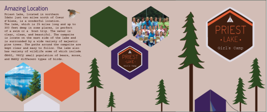
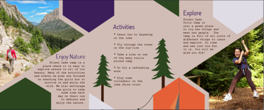
- Description:A two sided (duplex) folding brochure.
- Process (Programs, Tools, Skills): The first thing I did was create a logo so that when I went to start working on my brochure I would have a little more direction. I created the hexagon shape by using the pen tool and I created the tent with the shape tool. Once my logo was complete I started creating my brochure. I decided to do a tri-fold design so I set up the layout so that I knew what needed to go where. Once there are created the shapes such as the hexagons, trees, tents, and picture shapes with the pen tool. I then went in a added text boxes and adjusted them so they went along with the shapes. I also had to cut out a bird from a picture in Photoshop and insert it into the design then wrap text around it. The programs I used where Indesign, Illustrator, and Photoshop.
- Message: Tell people about Priest Lake Girls Camp and convince them to come
- Audience: Young woman age 12-18 and their parents
- Top Thing Learned: How to out a picture in a shape and how to text wrap
- Color scheme and color names: Triadic With Orange, Purple, and Green
- Title Font Name & Category: Dosis regular san serif
- Copy Font Name & Category: Foxprint serif
- Word Count of copy: 258
- Thumbnails of Images used:


- Sources (Links to images on original websites): http://www.inlander.com/Bloglander/archives/2012/03/28/idaho-greenest-state-ever
My own picture
http://en.wikipedia.org/wiki/Sawtooth_National_Forest
http://williamsburgvacations.com/things-to-do/go-ape-treetop-adventure/
http://360hdphotos.com/wonderful-bird-flying-winter-snowflakes/
Project 7: Web Page
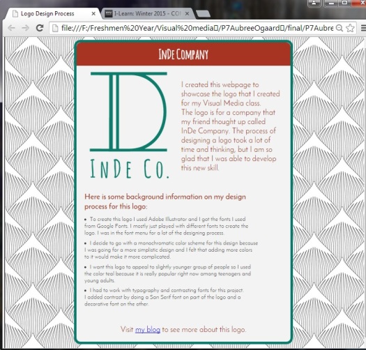
- Description: A web page to showcase a logo I design.
- Process (Programs, Tools, Skills):To create this webpage I used both Text Wrangler and Notepad++ I had never used html or Css so it was fun to learn about all the things you can do with it. I also used a couple websites to learn how to add things including w3schools.com. I added a logo that I had previously designed, and typed up all the web word content. I then adjusted the padding and font styles to make the web page presentable. I also added a picture from the web as a background.
- Message: This web page is to help showcase my logo deigning skills.
- Audience: Young adults
- Top Thing Learned: How to code a web page.
- Color scheme and color hex(s): Complementary brick, #a73422, and teal, #067B6B, with gray #F3F3F3.
- Title Font Families & Category: Amatic SC decorative
- Copy Font Families & Category: Josefin Sans Serif
- Changes made to the CSS: Font size, font style, font color, font weight, three background colors, padding, and alignment.
- Word Count: 203
Project 6: Stationary
Letter Head:
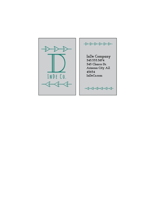
Business card (8.5×11 Layout)
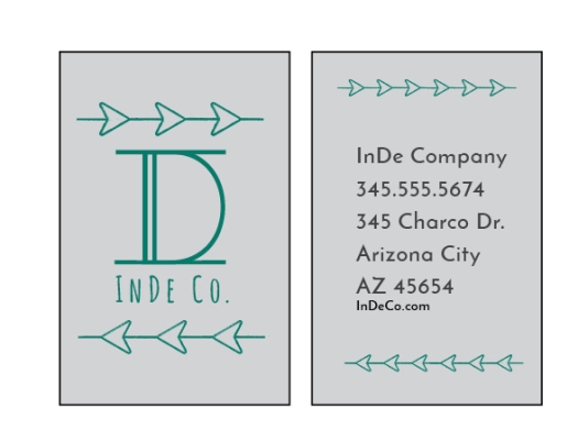
Business Card (Large Layout)
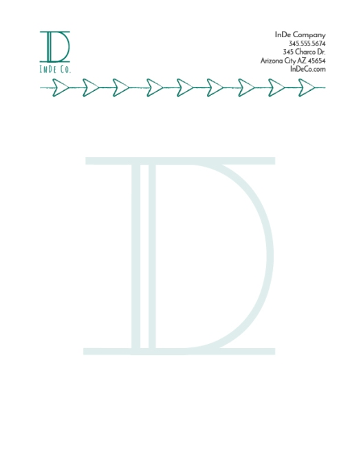
- Description: This is a letter head and business card for a company.
- Process (Programs
 , Tools, Skills): I used both Indesign and Illustrator to make these two designs. To make the logo I combined to letters together and drew the arrow things using the shape tool. I then used the those same elements all throughout both the designs. On the letter head I decide to put the logo in the top left hand corner and the contact info on the top right hand corner. I then added the arrow design that was on my logo. I also added a watermark on the letter head by taking a simpler version of the logo to the background and lowering the opacity
 - Message: These are suppose to make customers interested in the company as well as look professional.
- Audience: Young Adults
- Top Thing Learned: I learned how to use two programs together to make one design.
- Color scheme and color names: Monochromatic teal
- Title Font Name & Category: Large font on logo and contact info: Josefin Sans Semi bold- San Serif
- Copy Font Name & Category: Smaller font on logo: Amatic SC normal- Script
Project 5: Logos
- Description: Three variations of a logo for the same company
- Process (Programs, Tools, Skills): I got to work in Adobe Illustrator for this project. I used a lot of the shape tools to make the basic shapes for the sno cones and the castle. I added a gradient to the first and second logos to give it a nice multicolored look. For the lettering around the third logo I had the text follow a path so it would be curved.
- Message:
These are all logos for a Hawaiian shaved ice store. - Audience: Anyone who enjoys eating shaved ice.
- Top Thing Learned: I learned how to work a pen tool as well as how to effectively create shapes in Illustrator.
- Three Color Scheme and Color Names: Logo #1- Monochromatic: Teal Logo #2 Triadic: Red, Blue, Yellow Logo #3 Complementary: Orange and blue
- Three sets of Title / Body Font Names & Categories: Top logo: Title: Sacramento- script Smaller font: one font used. Middle Logo: Title: Century Gothic- San Sarif Smaller font: Book Antique- Oldstyle. Bottom Logo: Title: Cookie regular- script Smaller font: Corbel- San Serif
- Votes on favorite logo:
- Top Logo = 2; Middle Logo = 3; Bottom Logo = 5;
- My favorite logo is the top logo.
Project 4 Montage
- Description: This is a spiritually theme montage that focuses on blending two images and mastering topography.
- Process (Programs, Tools, Skills, Steps taken while designing)
I found the two images I wanted to use and set one as a background. Then I took the other image cut it out and put it on top of the other one. I had to flip the picture of the sister missionaries because they were facing the wrong way. I then blended the two pictures together. This step took a lot of work to get it just right. I then designed by text. I put a white box around the words to make them more legible. I only used one font but different line weights and styles to add emphasis. Finally I added a film grain filter (fitting for the theme) and masked out the bottom portion of the picture so only the sky had the filter. - Message:
I wanted to have a missionary themed message and I felt like a lot of LDS people would relate with the scripture that I used. - Audience:
Young Latter-day Saints - Top Thing Learned:
I learned how to create a mask layer which is incredibly useful. I also learned how to add texture to a design although I did not incorporate that skill into my design. - Filter / Colorization used and where it was applied: I added a film grain filter (fitting for the theme) and masked out the bottom portion of the picture so only the sky had the filter.
- Color scheme and color names: Triadic with blue red and yellow
- Title Font Name & Category: Humanistic 521 BT Italic
- Copy Font Name & Category: Humanistic 521 BT light
- Thumbnails of Images used:


- Sources (Links to images on original websites / with title of site):
Sister missionaries: http://www.deseretnews.com/article/865580487/USA-Today-takes-note-of-LDS-sister-missionaries.html?pg=all
Wheat field: http://hdwallpapers.cat/wheat_field_sunshine_sunset_nature_hd-wallpaper-1556523/
Project 2 Event Ad
- Description: This is an event ad I created for a charity drive hosted by Charity Ball.
- Process (Programs
 , Tools, Skills, FOCUS principles): I worked solely in Microsoft Word. I made sure that I had a good solid color scheme by using the color finder to pull colors form the picture. I also focused on alignment.
 - Message: This ad is trying to persuade people to come to the drive and donate money
 .
. - Audience: BYUI students and teachers
- Color scheme and color names: tetradic: blue, orange, red, and green.
- Top Thing Learned: I learn correct scanning
 techniques and how to use a color scheme to create and appealing design.
- Title Font Name & Category: Avenir Heavy: San Serif
- Copy Font Name & Category: Book Antiqua: oldstyle
- Scanned
 images used, sources, original sizes, location of scanner used:
Picture from charityball.org, 4×6, and the scanner in the Spori computer lab.
lab.
Project 1: Flier
- Description: Black and white flier to advertise for a graduation leadership conference.
- Process (Programs, Tools, Skills) I drew out four sketches and then I chose the one I liked the best. I then took that design and laid it out using Adobe InDesign. I put the picture on a black background to add contrast. I added further contrast by increasing the title font size to make it stand out. I created repetition by using grey boxes on the top and bottom. I left white space that is useful and not trapped. I used a small font size for the body so it wasn’t distracting but still large enough to read.
- Message: I am trying to convince graduate students to come to a leadership conferences by explaining the benefits of it.
- Audience: My audience are graduates.
- Top Thing Learned: I learned the importance of white space and giving words enough space to breath.
- Title Font Name & Category: Century Schoolbook/ Oldstyle
- Copy Font Name & Category: San Seriff.
- Links to images used in this project: Picture, Logo

